Markings & Identification Guide
The first thing most collectors do when they pick up a piece of pottery is flip it over and look at the bottom. With Van Briggle, the marks on the bottom can tell you a lot: when it was made, whether it's an original or a later reproduction, and sometimes even who made it. The problem is that these marks changed over the years, and the differences can be subtle if you don't know what to look for.
This guide brings together museum-quality reference photos from the Metropolitan Museum of Art's Ellison Collection alongside examples from our own collection spanning 1903 to 2004. For deeper research, explore the full Van Briggle Reference Library below, which covers dating, glazes, clays, individual craftspeople marks, and more.
Van Briggle Reference Library
Our complete reference collection for identifying and researching Van Briggle pottery. Each guide includes original photographs from archived collector websites, with proper attribution to the researchers who preserved this history.
Dating Your Pottery
Era-by-era guide to determining when your piece was made, from 1900 to present.
Explore guide →Mark Directory
200+ identified artist, finisher, etcher, and glazer marks with names and dates.
Explore guide →Glaze Reference
Complete guide to Ming Blue, Mulberry, Moonglo, and every Van Briggle glaze family.
Explore guide →Clay Body History
How the clay changed from Artus's 1903 formula through the Dryden era to today.
Explore guide →Novelty Items
Custom mugs, bookends, flower frogs, incense burners, and special commissions.
Explore guide →Historical Ephemera
Factory photos, catalogs, advertisements, and documents from across the decades.
Explore guide →What to look for
Van Briggle pottery marks typically include some combination of these elements:
- The conjoined "AA" monogram. This is the Van Briggle signature mark, combining Artus and Anne's initials. It is cut into the clay by hand on early pieces, and on the later pieces we have examined it is still cut by hand, usually inside a plain rectangular border. Expect the execution to vary from one worker to the next.
- VAN BRIGGLE or Van Briggle spelled out, sometimes in script, sometimes in block letters.
- COLO. SPGS or Colorado Springs, indicating the place of manufacture.
- Date marks. Some early pieces have the year incised (like "1902" or "1903"). Later pieces may have date codes or no date at all.
- Shape numbers. Many pieces have a number that corresponds to the design in Van Briggle's catalog.
- Finisher's marks. Some pieces have small initials or marks from the individual potter or finisher who worked on the piece.
The style and placement of these marks changed over the decades. Early pieces from 1901 to 1904 (during Artus's lifetime) tend to have hand-incised marks that are sharper and more deliberate. What becomes standardized in later production is the layout, meaning which elements appear and in what order, rather than the method. Late marks are still generally cut by hand, so they wander, and that wander is normal.
Museum reference: the Ellison Collection
The Robert A. Ellison Jr. collection at the Metropolitan Museum of Art is one of the best reference sources available for Van Briggle marks. Every piece in the collection has a dedicated high-resolution photograph of its bottom markings. These are all public domain, so zoom in and study them closely. The pieces span 1901 to 1904.
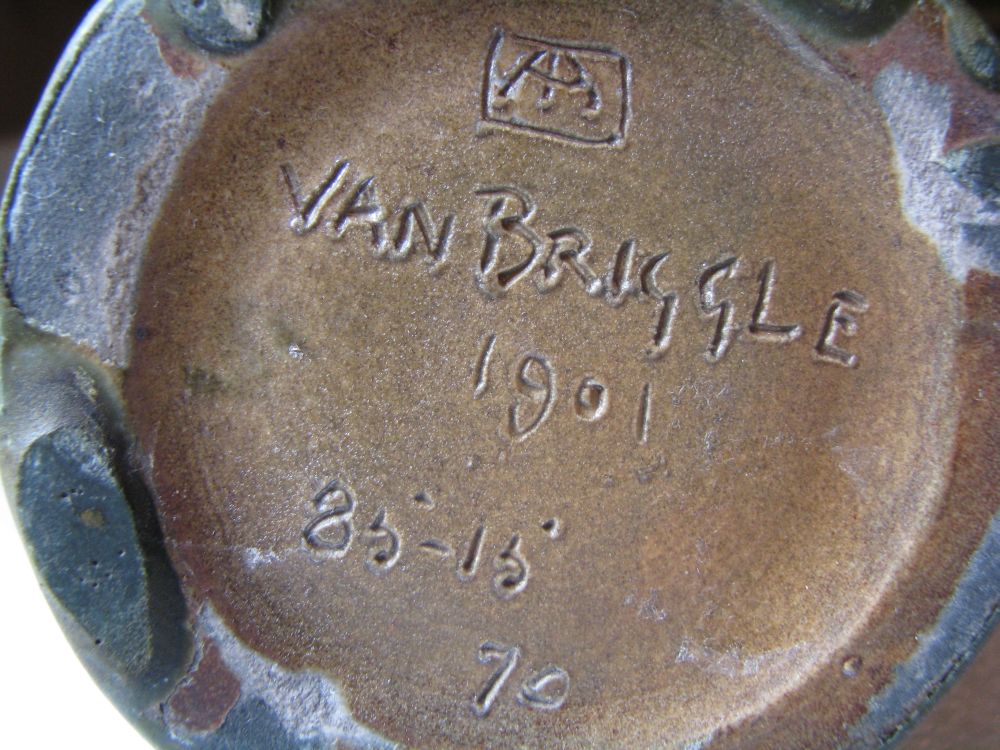
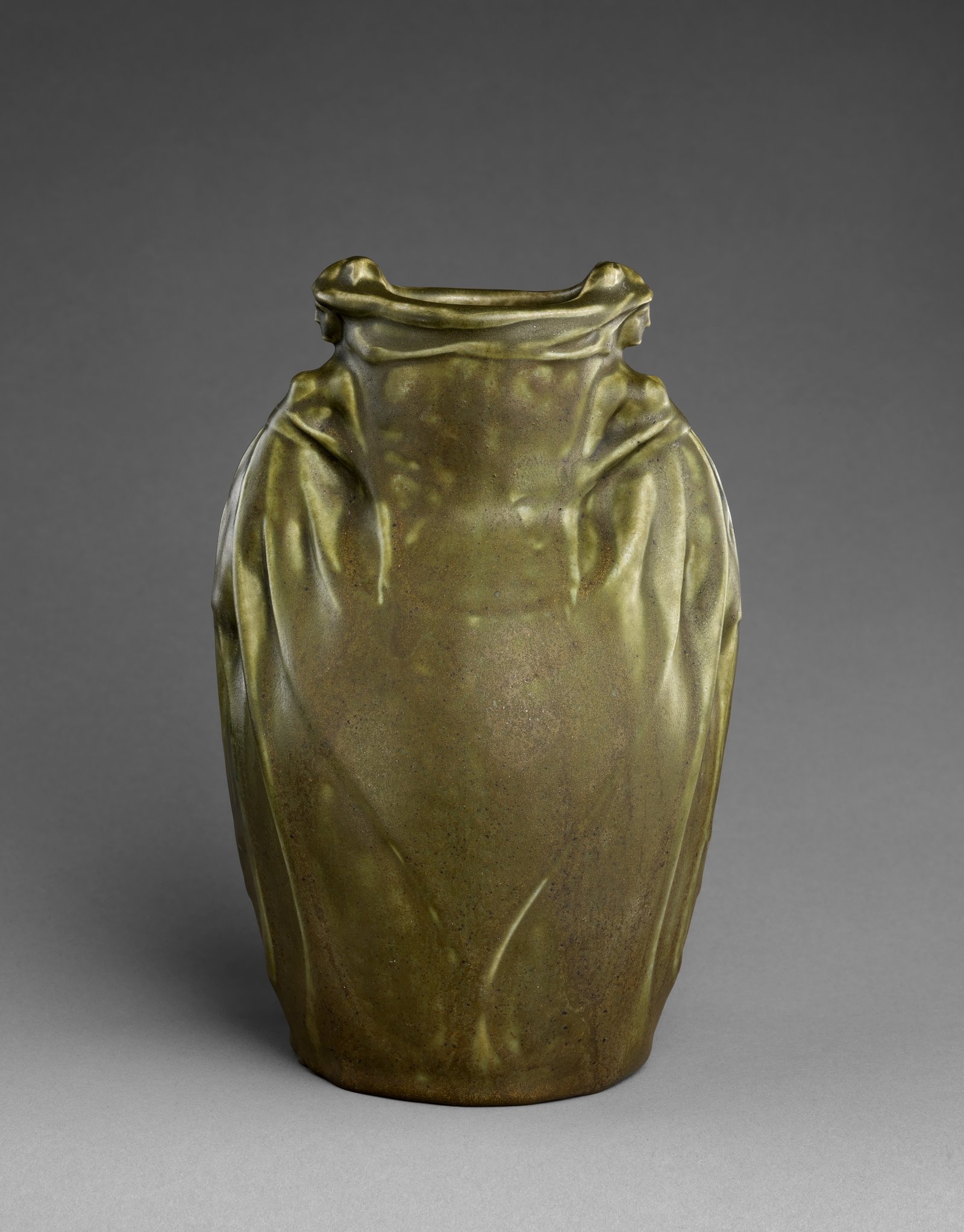
1901 Earthenware Vase
7 3/4 in. tall
The earliest piece in the Ellison collection. First-year production marks. This is what a genuine 1901 bottom looks like. Study this one carefully.
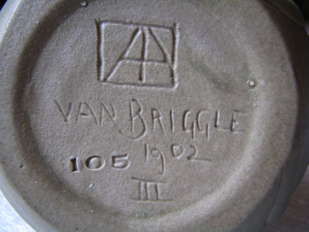
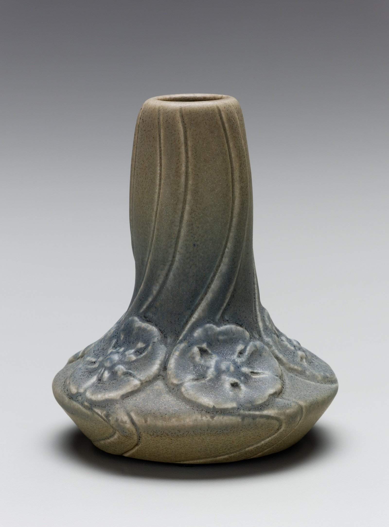
1902 Miniature Vase
3 5/8 in. tall
Marks on a miniature form. Even at under 4 inches, the AA monogram and date are clearly applied. Compare with its companion piece below.
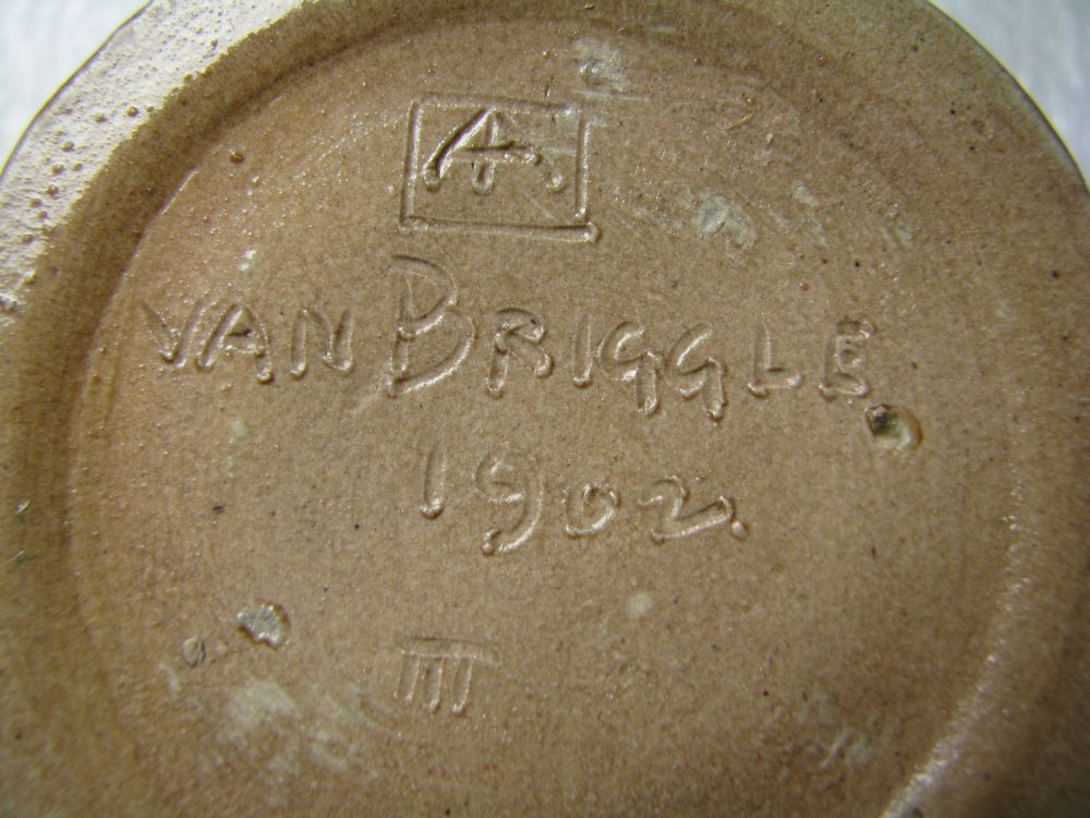
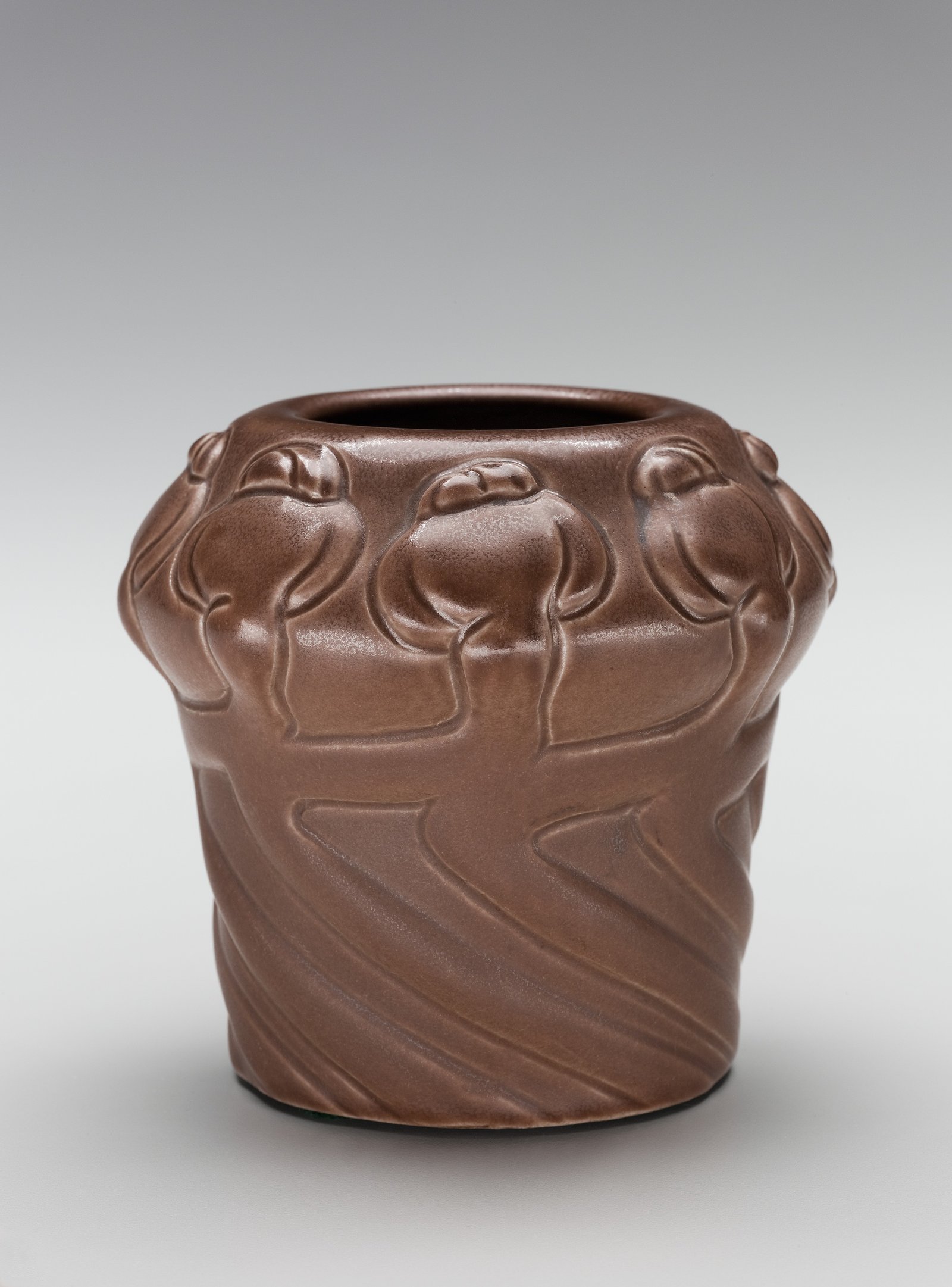
1902 Miniature Vase
3 11/16 in. tall
Nearly the same size as the previous piece. Look at how the marks differ even between two pieces from the same year. The variations tell you that different hands were applying these marks.
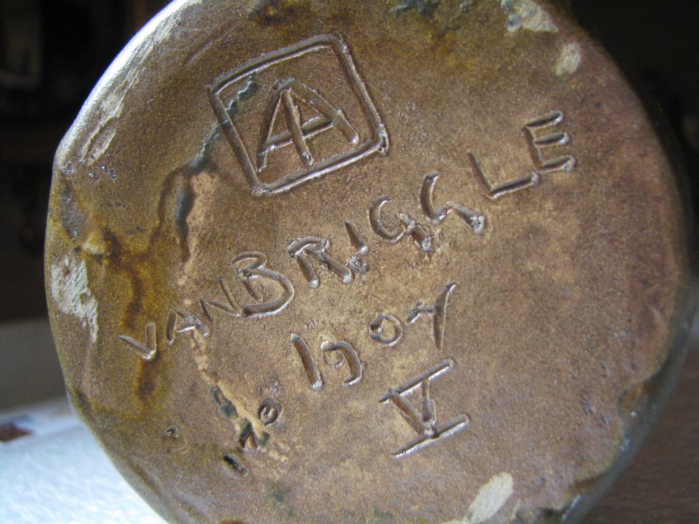
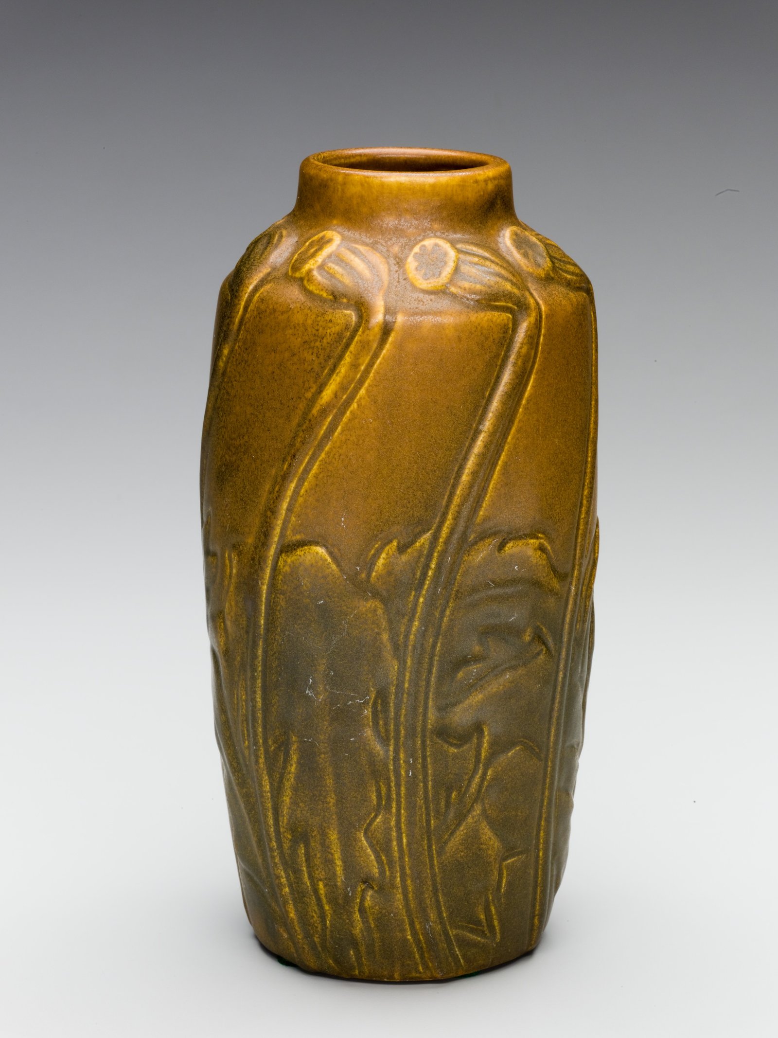
1902 Vase
9 7/8 in. tall
A larger 1902 piece with more room on the bottom for the marks. The increased surface area often means the marks are more legible on medium and larger pieces.
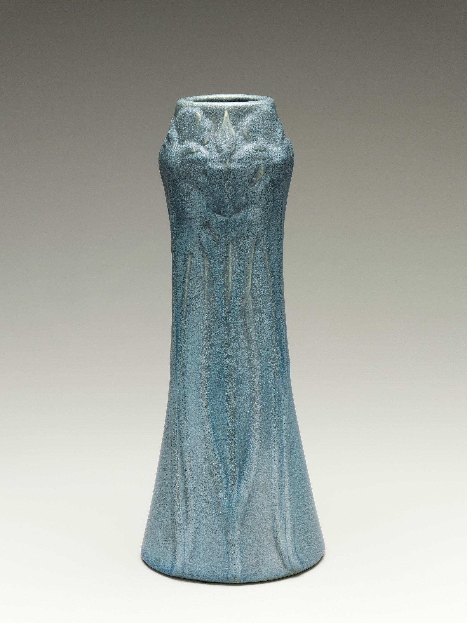
1903 Vase
One year later. Artus was still alive and overseeing production. Compare the style of the marks here with the 1901 and 1902 examples above. You should start to see the consistency in the hand-incised approach.
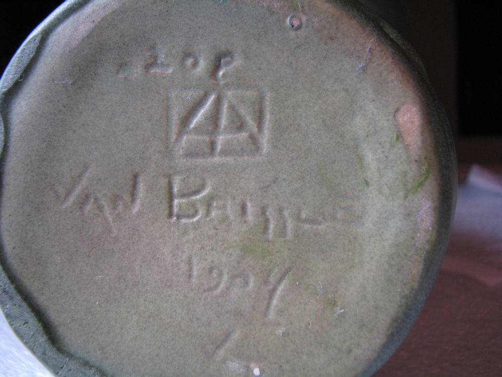
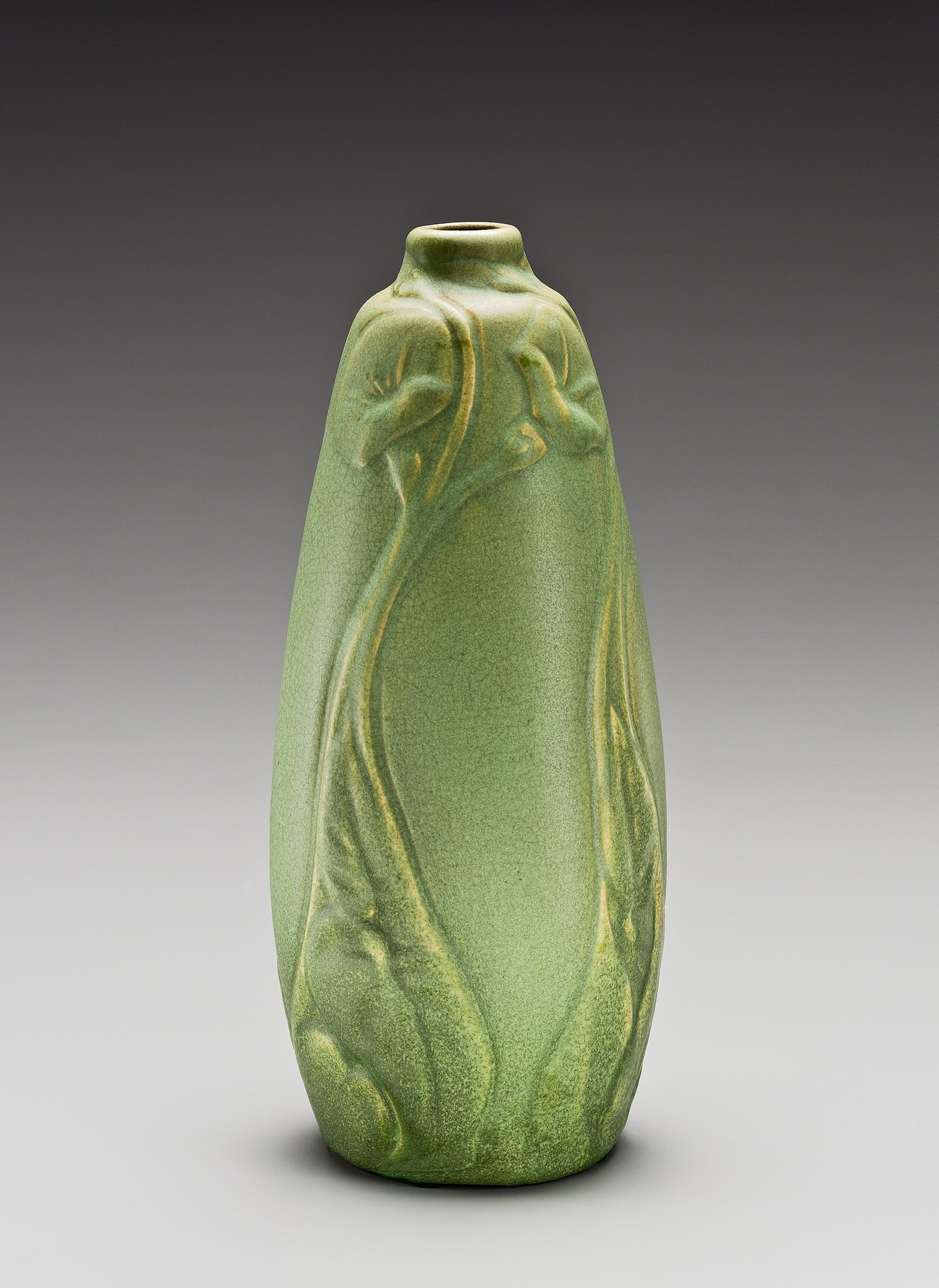
1904 Vase
11 7/8 in. tall
From the year Artus died. Pieces from 1904 are transitional. Some were made under his direct supervision, others were finished after his death. The marks on pieces from this year can show either approach.
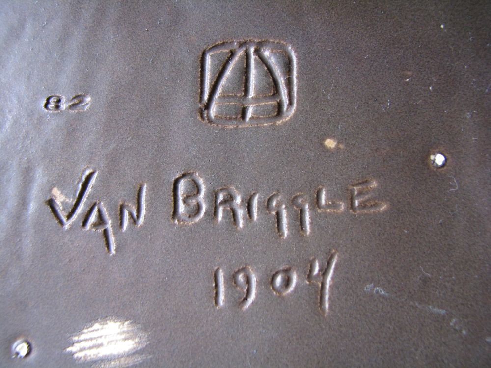
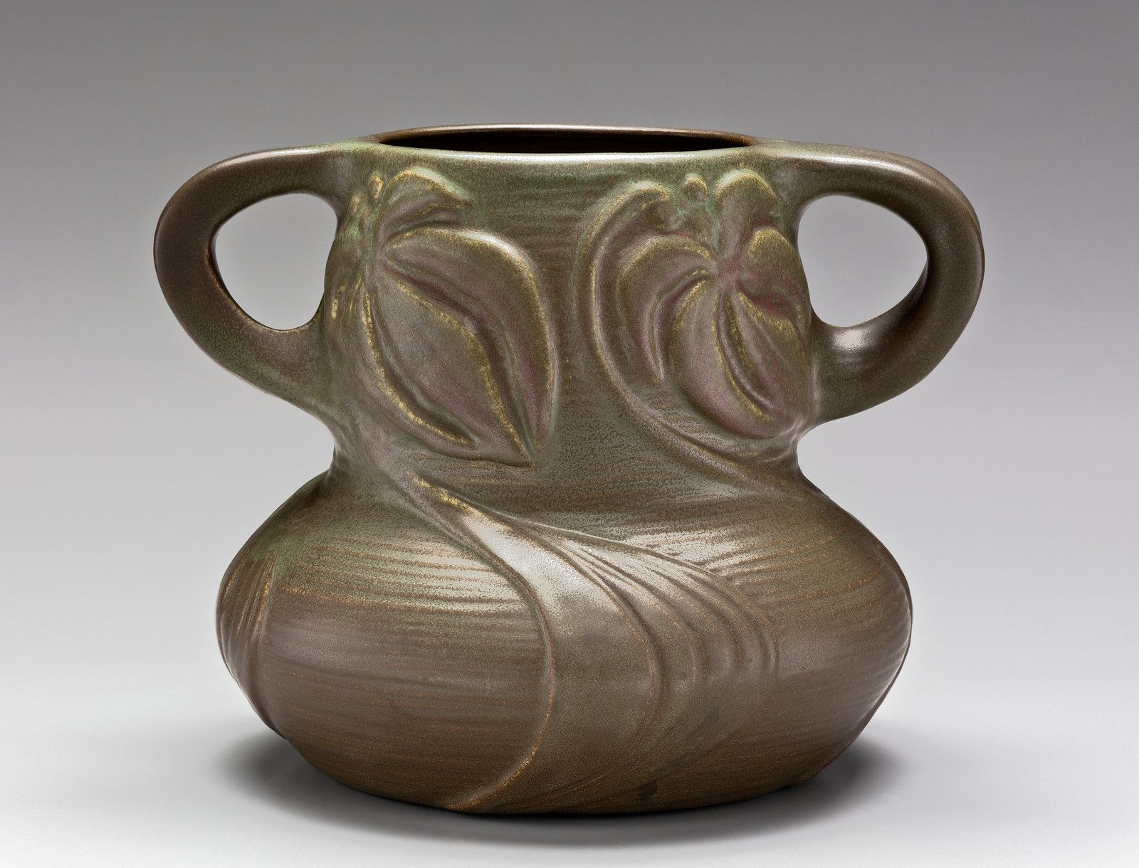
1904 Vase
7 1/2 in. tall
A second 1904 piece for comparison. Having two examples from the same year is a luxury. It lets you see what's consistent (and what varies) in the marking approach at this critical point in Van Briggle's history.
All museum images from The Metropolitan Museum of Art , public domain (CC0).
From our collection: marks over the decades
The museum photos above cover 1901 to 1904, the earliest years of production. But Van Briggle pottery continued for over a century, and the marks changed substantially. Here are some examples from our own collection that show how the bottom markings evolved through the 1900s and into the 2000s.
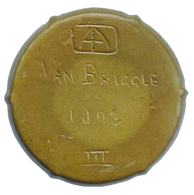
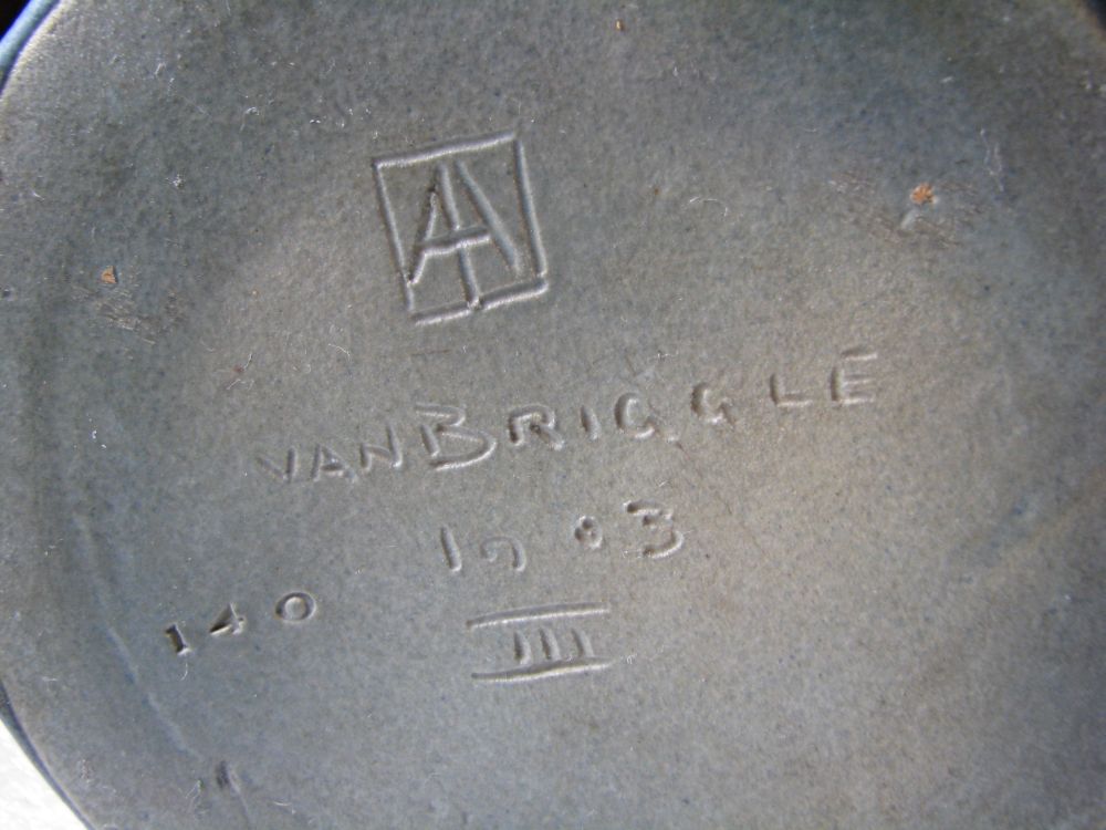
Circa 1903
Hand-incised marks from the Artus era. The AA monogram, date, and shape number are all carved into the clay before firing. This is what you want to see when you're looking at a piece claimed to be early Van Briggle. The lines are deliberate and vary slightly in depth, the way hand-incised marks always do.
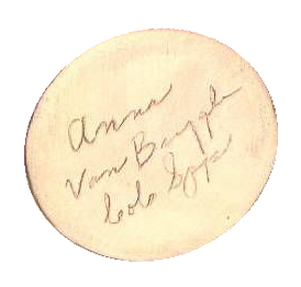
Circa 1950s
This one is an Anna Van Briggle mark, the line produced from 1952 to 1968, and it is worth showing because it does not look like what people expect. There is no AA monogram on it at all. The whole mark is a flowing cursive signature reading "Anna Van Briggle" over "Colo Spgs," written into the clay by hand.
If you have a piece with a cursive "Anna" and no monogram, it is not a piece missing its logo. It is this line. Note that the Anna mark is a specific script and belongs to a high-gloss body of work; do not confuse it with the later glossy Moonglo pieces, which carry the ordinary AA mark. Our dating guide covers the Anna era in more detail.
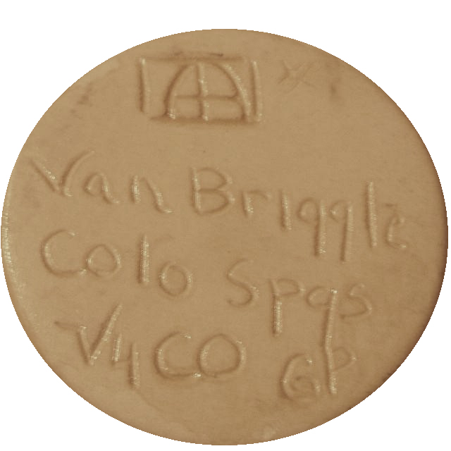
Circa 2004
Late-era production before the pottery closed in 2012. The layout is standardized by this point: AA monogram inside its rectangular border at the top, then "Van Briggle," then "Colo Spgs" and "Colo," with the worker's initials tucked into a corner.
The marks themselves are still cut into the clay by hand, not pressed in from a mold. Look closely at this one and the lines wander: the borders of the box are not quite parallel, the strokes vary in depth, and there is a slipped double-cut at the lower left of the monogram. A molded mark would come out identical on every piece from that mold. Compare this monogram with one from a piece made a decade or two earlier and you find the same design drawn by a different hand, at different proportions. So a late mark is standardized in what it says, not in how it was applied.
Why is the AA inside a box?
This is one of the most common questions we get by email, usually phrased as a worry that the piece might be a fake. It isn't. On later commercial pieces the AA monogram is very often drawn inside a rectangular border, and it is entirely normal.
The monogram itself is two capital A's conjoined, sharing a crossbar, for Artus and Anne Van Briggle. On later pieces a plain rectangular border is drawn around it. The border is a separate element, not part of the letters: the two A's sit inside it with a visible gap between their outer strokes and the sides of the box. What reads as a window pane at a glance is really a border, two arched A strokes, the vertical they share, and their crossbar.
Expect variation in how neatly it is drawn, because it is cut by hand. The proportions of the box, the weight of the strokes, whether the A's are arched or sharply peaked, and the tidiness of the surrounding lettering all differ from piece to piece and from one worker to the next. The 2004 bottom above and pieces from the 1980s and 1990s carry the same design executed noticeably differently. Variation on its own is not evidence of a problem, and in fact a mark that looks mechanically perfect is more worth a second look than one that wanders.
The boxed AA is a weak dating clue by itself, since it spans decades. Pair it with the clay color at the bottom, which is the strongest single indicator, and with any finisher initials next to the logo.
See the clay body history for the white-to-buff change in 1970, and the mark directory for finisher and artist initials.
Side-by-side comparisons
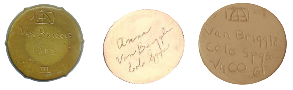
When you put different eras next to each other, the evolution becomes obvious. Early marks are hand-carved, individual, slightly irregular. Mid-century marks are cleaner and more consistent. Late marks are fully standardized. Once you've studied a few examples from each era, you'll be able to estimate a piece's age just by looking at the bottom.
Further resources
- Dating Your Van Briggle — Era-by-era guide with reference photos showing how bottom marks changed from 1900 to the present.
- Artist & Maker Mark Directory — 200+ identified artist, finisher, etcher, and glazer marks with names and dates.
- Van Briggle at the Met — Full documentation of 17 public domain pieces from the Metropolitan Museum, including the Ellison marks photos shown above.
- Researching Your Van Briggle Pieces — Books and references for identifying and dating your pottery.
- Encyclopedia of Marks on American, English & European Earthenware — Schiffer reference covering pottery marks from 1780 to 1980, useful for identifying non-Van Briggle pieces you encounter alongside your collection.
- UV Blacklight Flashlight — Under ultraviolet light, repairs and touch-ups fluoresce differently than original glaze, helping you spot restorations before you buy.
- 10x Triplet Jeweler’s Loupe — A proper triplet lens resolves incised dates, Roman numerals, and finisher numbers that are too small or worn to read with the naked eye.
- Values & Prices — What your Van Briggle piece might be worth.
- Contact us — Have a piece you need help identifying? Send us photos of the marks and we'll do our best to help.